Luxury Advertising concepts and brand campaigns by Patric Pop in Geneva.
Knowing the codes of successful advertising for luxury companies is only a part of the game. The other part is played by the brands’ high quality promise. In luxury advertising, most often, the product is the star.
“The product is the star.”
Designed with a clear vision and meticulously crafted by masters of their trade, most luxury products help us live our lives easier. Not because of them being particularly great at solving a problem. Mostly, there is no USP (Unique Selling Proposition). But because of their heritage, the savoir-faire that is passed-down from artisan to artisan, the luxury item gives a bold statement. It reassures us to feel the quality when using or wearing it.
Luxury in the creative process
Successful advertising for the luxury sector happens after research, strategic reflections, precise briefing and an extensive brainstorming process. Because only the strongest ideas make it into concepts that I am proud to present to my clients. The final concept chosen gets refined until the headline and content are on spot with the idea.
Specialists in their fields
Parallel to that I direct specialists or create the artwork, be it photography, illustration, motion graphics or video. The right choice of media, be it OOH billboard posters or content for uploading, depends on focusing on the brand’s specific target groups. Working closely with the leading media planners in Switzerland, synergies can be created and more visibility for your brand at the same cost created.
I bring in 20+ years of experience in delivering solutions on all communication challenges.
Graduating from the renowned Art Center College of Design in Pasadena, California with a Bachelor in Communication Design, I have had the opportunity to work on an impressive client list of iconic brands and winning multiple, prestigious awards.
Below you’ll find my personal selection of published work, as well as some of the concepts that were not retained by the clients. Enjoy!

Client: Caran D’ACHE
Agency: formerly Simko, now Saatchi Saatchi Simko, Genève
Media: Print, Billboards, Event stands
Patric Pop's role: Concept, Creative Direction
Concept: The Ecridor Collection of Caran d’Ache is an all-time favourite by the Swiss and visitors to offer as a gift. Once you write with an Ecridor, you do feel the massive weight and the the detailed crafting in your fingers. Wonderful things start to form at the tip of the fountain pen. That is the reason why we kept the visual as sober as possible, simply adding a slanted CDA logo below in an understated anthracite to not compete with the star of the advertising.
Photographed by prestigious luxury object photographer Joel von Allmen.

Deutsche Bank Private Banking, associated to Patek Philippe in this advertising.

Deutsche Bank Private Banking, associated to Van Gogh art collection in this advertising.
Client: Deutsche Bank Private Banking (Global)
Agency: formerly Simko, now Saatchi Saatchi Simko, Genève
Media: Print
Patric Pop's role: Concept, Creative Direction
Concept: Deutsche Bank Private Banking did win numerous awards as the best foreign private bank in Switzerland. A foreign bank in Switzerland, the homeland of banking? The concept was born: one nation inventing and another nation improving it later and becoming world famous for it. Please note that the mechanical watch was invented by the Germans and only later the Swiss took over.
Even with strict corporate branding guidelines (Logo placement, colours, typography) it is possible to create inspiring and memorable image campaigns.
Extension of the Concept: In a move to value the team behind the award, Deutsche Bank Private Banking Switzerland wanted to also showcase some of their extraordinary team members. Based on the original concept, it was possible to play a bit with the different nationalities vs. a Swiss based bank and portray some of the most illustruous employees for this campaign. Photography by Hugh Schofield.


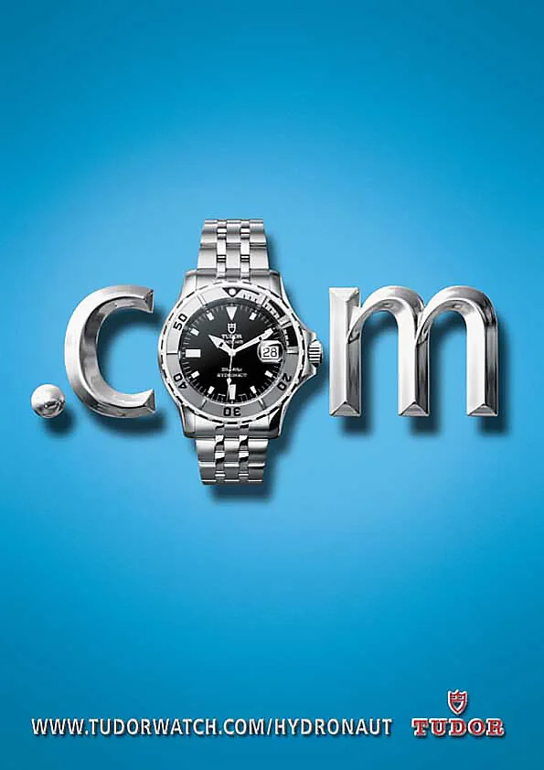

The TUDOR ad for the Chinese market.
Client: Tudor by Rolex
Agency: formerly Simko, now Saatchi Saatchi Simko, Genève
Media: Print, Billboards, Event stands
Patric Pop's role: Concept, Art Direction
Concept: Tudor is the sub brand of one of the world’s most iconic luxury watch companies Rolex. For the launch of the new website, we decided to demonstrate this in typical luxury code of generous space and reduced elements, yet with breaking a bit the same code. For the model Hydronaut, the color chosen was a hint of iridium blue. Other models were sporting strong crimson red, or monarch orange. Greatest care was given to spotlessly retouching the watches in their tiniest details.

“The first time I saw it, it took me some time to pull myself together.”
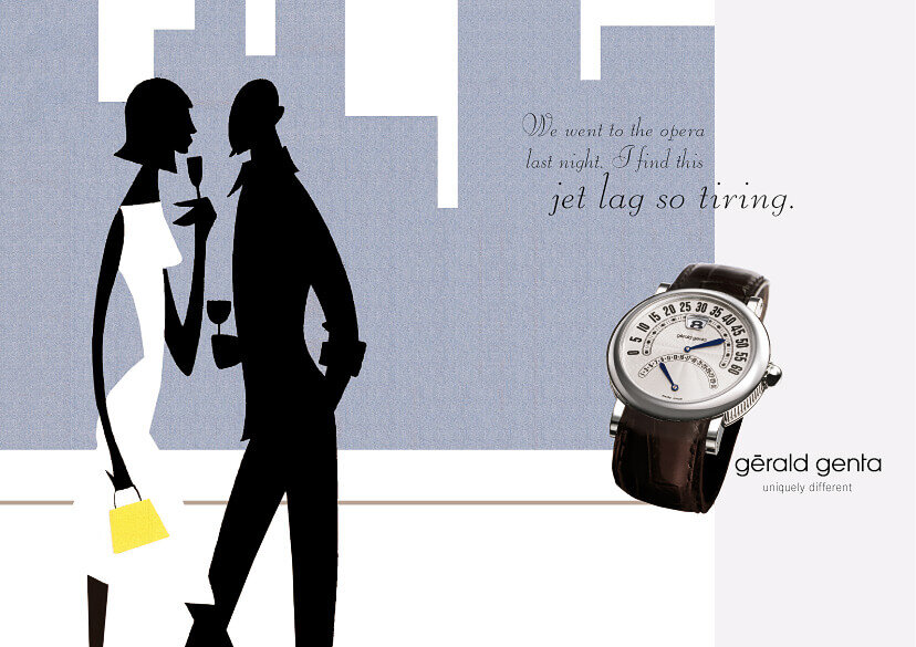
“We went to the opera last night. I find the jet lag so tiring.”

“The chrono absolutely bowed me over. It is in a different world.”
Consumer Catalogue

A double-page spread of the catalogue proposal for the Classic line.


A double-page spread of the catalogue proposal for the Sport collection.

Client: BULGARi / Gerald Genta
Agency: Label Communication, Geneva
Media: tbd
Patric Pop's role: Concept, Creative Direction, New Business Pitching
Concept: When the iconic brand Gerald Genta was sold to Bulgari, the agency was invited to pitch for a new brand communication. The brilliant watch designer had collaborated on Omega's Constellation (1959); Patek Philippe's Golden Ellipse (1968). Audemars Piguet's Royal Oak (1970), IWC's Ingenieur (1976); Patek Philippe's Nautilus (1976); and Cartier's Pasha de Cartier (1985).
To differentiate the brand, the claim “Uniquely different”, as well as the brand name are all written in lowercase.
For this presentation I chose the theme of elegant illustration accentuating the particular design of the Gerald Genta watches. At the same time the idea was to play with the preoccupations of the target group and add a sly sense of self-irony.. The campaign presentation was executed in both, English and French. The artwork was as refined as possible and even some main paragraphs were written out.
Client: BULGARi / Daniel Roth
Agency: Label Communication, Geneva
Patric Pop's role: Concept, Creative Direction, New Business Pitching
Concept: Famous for its specific tonneau housing, our agency was asked to come up with a new concept to target younger markets. To show the resemblance of the tonneau housing to a face, I decided to run a side-by-side campaign. The chromatic use of the colouring was influenced by the color of the wristband and the materials used on the watch itself. Brand slogans were “ A perfect match.” and “Qui se resemble s’assemble”.


Consumer Catalogue: a double-page spread of the catalogue. The horizontal format was chosen to create more room for each product. By cropping the portrait a more dynamic, cinematic look is created.


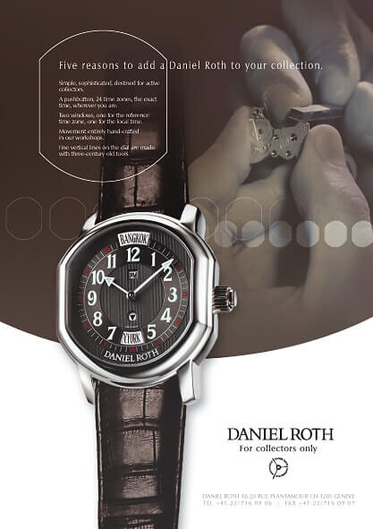
Client: BULGARi / Daniel Roth
Agency: Label Communication, Geneva
Patric Pop's role: Concept, Creative Direction, New Business Pitching
Concept: Another campaign proposal for Daniel Roth aimed at watch connoisseurs and collectors of the haute horlogerie. Based on the brand claim For Collectors Only, we speak to collectors listing 5 unique properties of owning a little masterpiece. To illustrate the savoir-faire, imagery of watchmakers’ masterly craftsmanship are shown. The design codes are more classic. But the tonneau shape is repeated throughout the campaign, looking a bit like a movie. The idea was to develop these visuals also for film.

Consumer Catalogue: a double-page of the catalogue displaying on every spread the information in two languages.


Client: CITROËN
Agency: EuroRSCG Geneva
Patric Pop's role: Concept, Creative Direction
Concept: For the launch of its latest luxury limousine, the C6, Citroën chose several agencies within the EuroRSCG network to propose a concept for the global laugh campaign. The task was to create a concept that would enhance the noble and refined image of the car. Citroën positioned this car as the new follower of the legendary classic the “DS”.
My concept was to show the car in a minimalistic reduced environment where the surroundings fall in love with the C6. The sidelines o the road caress the limousine and the claim read “Pure Desire”. To keep the brand visuals updated all year long, the concept would be adaptable to all seasons: Hands shaped from water would be guiding the car safely on the rainy drenched road - thanks to the automatic stabilisation aquaplaning would be prevented. Or hands would be shaped from dead leaves for the autumn.
Unfortunately, Citroën did not choose this concept for the launch of the C6. However, some time later, the PSA group used this concept for the TVC advertising for Peugeot…
Rough sketches by the late Wolfgang Brüggemann.

We worked on the angles to show the best view of the Citroën C6.


Water drops form the protecting hands to prevent aquaplaning.


Client: Montblanc
Agency: Patric Pop, Geneva
Patric Pop's role: Concept, Copywriting, Art Direction
Concept: Tourism plays a big role for luxury companies in Switzerland. Montblanc asked me to create information material to be handed to chinese tour operators. For the Geneva branch of Montblanc this meant showing special trips to the manufacture in the Jura, and collaborations with several hotels in the heart of the city. When the tourists paid a visit to the Montblanc manufacture and the store, a Polaroid in a customised image stand in shape of the brand’s 6 valleys’ logo, was given to them.

Client: DRAKE STORE, Geneva
Agency: formerly Simko, now Saatchi Saatchi Simko, Genève
Media: Print, OOH billboards, poster
Patric Pop's role: Concept, Art Direction, Supervising the photography and the production process
Concept: A fun little project
Drake Store is an high end fashion boutique in down-town Geneva offering prestigious brands for women and men.
The idea was to show typical elements that can be found at the store in a playful manner. There were some stellar ideas presented to the client, which had the potential to win advertising awards. In the end it was decided to go with the exotic creatures campaign built from clothes found at the store. In the photostudio of a high end product photographer, we created a jungle with real plants.
Due to great planning and communication with the photographer, it took us only one image to shoot the Cobra photo and minimal retouching.